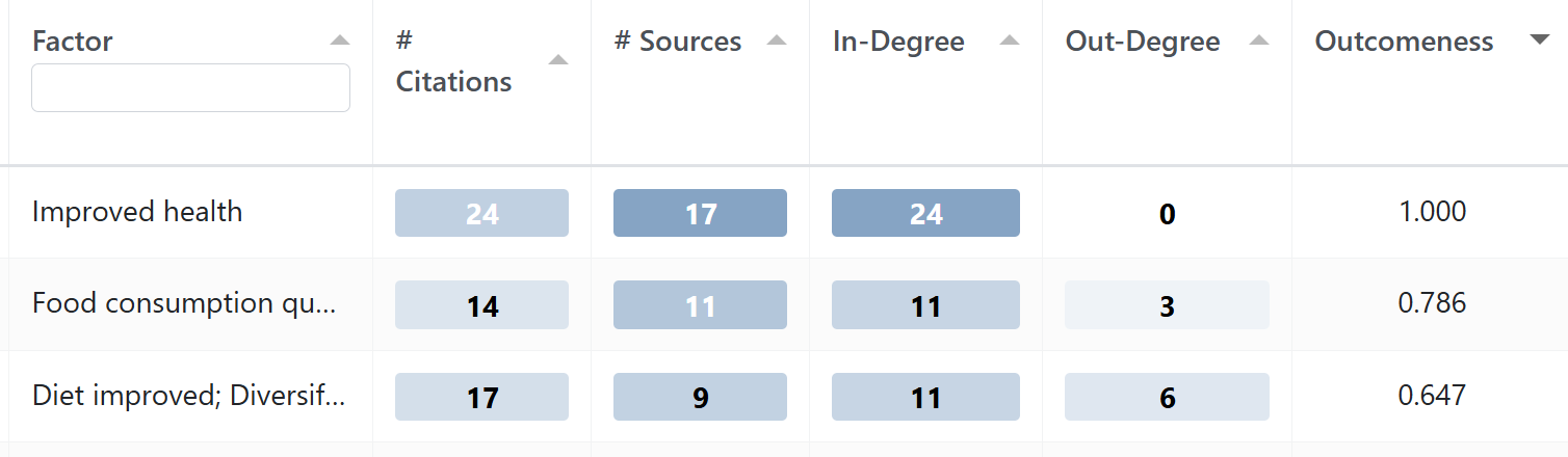
What do we even mean by “outcome”? A factor might have a lot of incoming links, so it is often mentioned as the consequence of something, but it might also have a lot of outgoing links, so perhaps plays more of an intermediate role. One way to answer this question is to calculate the “outcomeness” for each factor: the number of citations of its incoming links divided by the total number of times it was cited.
Outcomeness: one simple “role” metric is the proportion of incoming vs outgoing citations (a normalised Copeland-style score) (Copeland 1951).
High outcomeness means that a factor was often at or near the end of causal stories. A table of factors listed in descending order of outcomeness can help for example, to better understand the perceived impacts of your project or implementation.
Outcomeness is a useful measure of whether a factor is more of an outcome or a driver#
Causal Map primarily uses the Graphviz DOT layout engine which does an amazing job of teasing out such a story if there is one. Generally speaking, the "drivers" will be on the left and the outcomes will be on the right, but at the same time trying to maintain readability and avoid the links crossing over factors or over each other. Which is always a compromise. For this reason we also usually use "outcomeness" colouring for the factor backgrounds, which represents the proportion of all the factor's links which are incoming links. So normally factors on the right are darker, except where Graphviz has had to reposition some of the factors for readability. So, does it look like a ToC? Of course that depends on what you expect a ToC to look like and famously there are no standards for that.
If the causal map is more or less neatly hierarchical, then our map will reflect that nicely and therefore "look like a ToC" but of course that's rarely the case.
We often see that for reports, folks often take the original causal map and get a designer to redraw them anyway to match the report styling etc.
In the upcoming version 4 of Causal Map, there is a more interactive style of map where it's possible to drag the factors around to put them just where you want them.
References
Copeland (1951). A Reasonable Social Welfare Function.